
Who this is for
One person who built a site with Lovable, Bolt, v0, or Replit. They shipped in an afternoon, iterated three or four times, and hit a wall. The site works. It also looks AI-made, converts badly, and they cannot tell which of those is the actual problem.
They have no designer, no budget for one, and no vocabulary for what is wrong. What they have is a next action they are willing to take if someone names it.
That is the entire customer. Everything below follows from it.
The problem, as a designer sees it
AI builders solved: can I ship? Nobody solved: is this any good?
The existing answer is a scanner that returns forty findings in a flat list. For a solo founder, that is worse than nothing — it converts one vague anxiety into forty specific ones with no indication of which matters. They close the tab.
The gap is judgment. Taste, restraint, and knowing what actually moves a visitor to act. That does not scale by hiring designers into a $20-a-month product. So the question I took on was: can fifteen years of design judgment be written down as a rubric that holds up without me in the room?
Why I thought a designer should build this
Engineers build most tools in this space, and it shows in what they optimize for: coverage. More rules, more checks, higher detection counts.
Coverage is the wrong metric for this user. A solo founder does not have a coverage problem. They have a decision problem. The design work is not finding more — it is deciding what not to say.
That reframe is the product.
Project details
Product | UXtion (uxtion.ai) |
Platform | Web, SaaS |
Role | Founding Product Designer — end-to-end |
Customer | Solo founders and small teams shipping with AI page builders |
What I owned | Customer definition, product strategy, what the audit evaluates and what it refuses to, the fix format, UX, design system, QA |
Implementation | Built with AI as the implementer. I directed it, set acceptance criteria, and rejected output that did not meet them |
Status | Live |
Outcome
- ⏱ Solo-built and shipped to production in 14 weeks
- 💻 Designed to a 60-second budget from URL to a full result, with a 73-second hard ceiling
- 🎨 Design system built to WCAG 2.2 AA, with contrast owned by code rather than by a spec document
What I learned about the user
They do not want a report. They want to know what to paste next. Length reads as thoroughness to the person writing it and as homework to the person receiving it.
They cannot name their own page’s goal. Ask a solo founder what their landing page is for, and you get a description of the company, not the page. This surprised me, and it changed the product.
They are not optimizing for completeness. They are optimizing for momentum. One obvious next action that unblocks shipping. Everything after that action is noise until the action is taken.
Three directions I considered
A — A better scanner. More rules, cleaner presentation. Cheap and predictable. Rejected because it does not touch the qualitative half of the problem, which is the half the user cannot self-diagnose. It also competes on coverage, which I had already decided was the wrong axis.
B — AI-smell detection as the wedge. Aimed at the loudest complaint: my site looks AI-made. Fast to build, easy to market. Rejected because the moat erodes on its own — every improvement in the page builders makes the product less necessary. Building something whose value decays as the market matures is a bad trade.
C — Judgment against the page’s actual goal. Selected.
The differentiation is not finding flaws. It is knowing what the page is trying to do, then evaluating craft, conversion, and availability against that. Without a goal, nothing can be prioritized — which is why establishing the goal became the first thing the product does, not a setting buried somewhere.
What I decided the audit should contain
This is where most of the design work went.
Three judgment lenses. Craft, conversion, accessibility. Not because the list is exhaustive, but because those three are what a senior designer would actually raise in a review and what this user cannot evaluate on their own.
Technical checks kept separate. Are crawlability, meta tags, schema markup, URL structure, and links true or false? They belong in the product — a founder should know if their page cannot be crawled — but not in the same list as judgment findings. If they shared a list, a missing meta description would outrank a CTA that is losing conversions, purely because it is easier to detect and easier to state confidently.
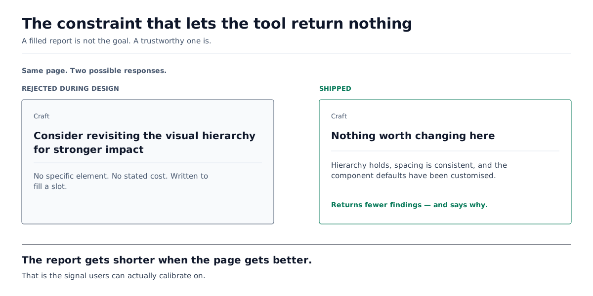
Every finding names a concrete element. “Consider revisiting the visual hierarchy” is not a finding. It is a way of sounding like a designer without being one. If a finding cannot point at something on the page, it does not ship.
Every finding states a cost, not a rule. Not this violates a guideline, but this is what it costs you, given what this page is for.
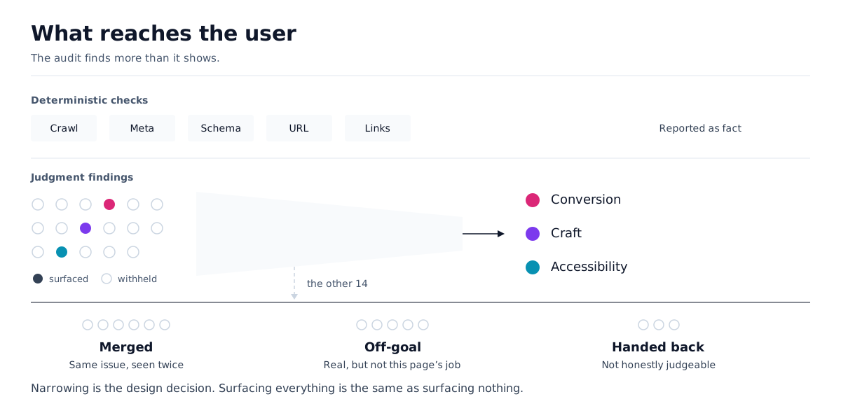
Narrowing is where the product lives. Everything cut is either a duplicate of something that survived, is real but irrelevant to this page’s goal, or is something the tool cannot judge honestly based on what it can see. That third category is handed back to the user rather than asserted — which cost me a finding and bought the report its credibility.
What I decided it should refuse to do
It is allowed to find nothing. The rubric permits an empty craft result. If the page is clean, the report says so and gets shorter.
This was the hardest call and the one I would defend first. A model asked for three craft findings; it will produce three craft findings, and will not mention that two were invented to fill the request. Filling the quota would have destroyed trust faster than missing an issue ever could. A design reviewer carrying a note on every screen is not rigorous — they are unreliable, and eventually ignored.
It does not guess at things it cannot see. Exact contrast values cannot be read reliably from a capture. Rather than asserting a number, the interface hands that judgment back to the user. Precision is not always available; saying so is what keeps the rest of the report credible.
It does not claim full coverage. Automated identification has a real ceiling. That limit is stated in the product copy rather than papered over.
The goal step, and why it is not skippable
The product proposes what the page is trying to do. The user confirms or corrects it. Nothing is evaluated until they have.
I tried to skip it. Inference was accurate often enough that a confirmation step appeared like friction I was adding to a product whose whole promise was speed.
Then I watched it get the goal wrong. A signup form on an enterprise page reads "sign up" even when the page is selling a sales call. A waitlist below the fold loses to product photography above it. A blog layout is assumed to be read when it exists to convert readers to a trial.
What matters is not that inference was imperfect. It is what a wrong goal produces: not a slightly worse report, but a confidently wrong one, already prioritized and already formatted as a fix. The user has no way to tell the difference.
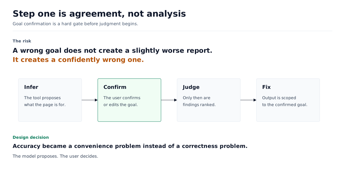
So the fix was not a better inference. It was making the user the final authority. That is a UX decision, and it is the one I am proudest of.
The fix format
A finding the user cannot act on is not worth surfacing. So every finding ends in a fix that is:
- written in the audited page’s own components and tokens — nothing new to import, and none of UXtion’s design language leaking into someone else’s site
- scoped to one element, with “do not touch anything else” stated explicitly
- pasteable into the tool they already use
- saved as a reusable rule, so the same mistake does not return in the next session

The reusable-rule part matters more than it looks. A one-off patch breaks again the next time the builder regenerates the section. A rule the user can feed back into their own tool is the difference between a favor and a system.
The design system
This governs the product’s interface and the vocabulary used in the report. It is deliberately not what fixes are written in — those use the audited page’s tokens.
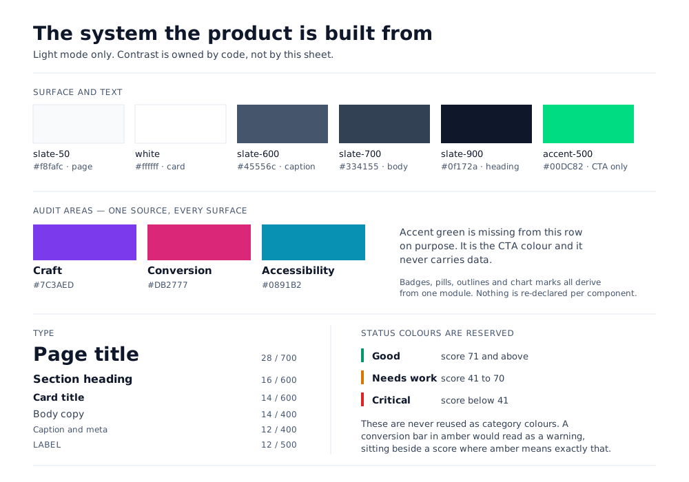
Two decisions in here are worth naming.
Contrast values are not written in the spec. They are computed in code and enforced by a contrast gate in CI. A ratio typed into a document is true on the day it is typed and silently false afterward. Moving the number to the place that can actually check it is the difference between a design system and a design document.
Severity is carried by the word, never by the color alone. The color simply reinforces it.
One category, four colors
Late in the build, I audited my own system and found that conversion was rendering in four different colors across four surfaces — two ambers and two blues. The landing page and the dashboard were describing the same thing differently. Nobody had reported it.
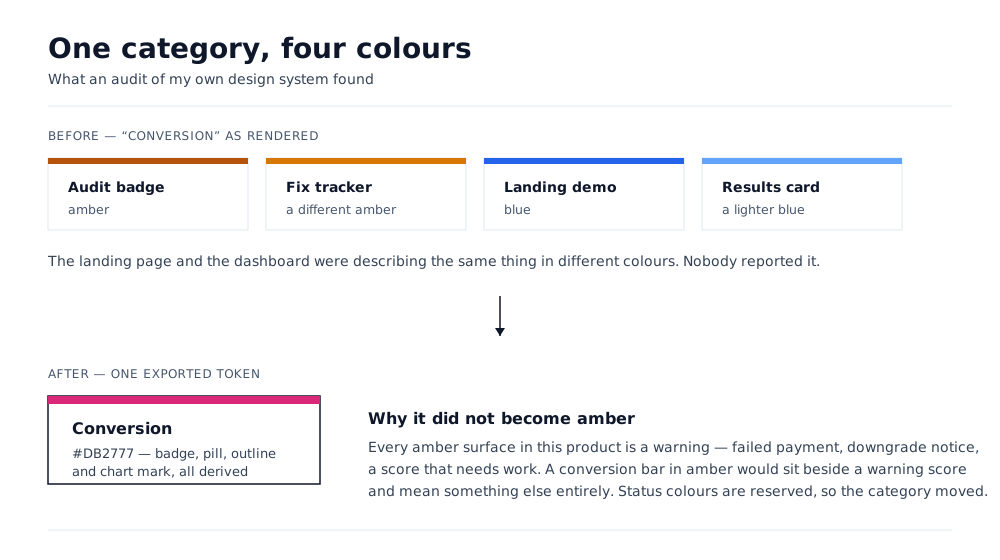
The interesting part is not the inconsistency. It is where the fix landed. Amber was the majority color, so standardizing on it was the cheap answer — but every amber surface in this product is a warning: failed payment, downgrade notice, a score that needs work. An amber conversion bar would have stood next to a warning score and meant something else entirely.
So the category has moved to pink, and all four surfaces now derive from a single exported token. Status colors are reserved. They are not reused as category colors, even when that is the most convenient option.
That is the kind of decision a design system exists to make, and the kind that never happens if nobody owns the system.
Working with AI
I did not write the code. I want to be precise about what I did do, because the distinction is the job.
What I delegated. Implementation, entirely. I described behavior; I did not specify how to build it.
What I would not delegate. What the audit evaluates. What it refuses to evaluate. What counts as a finding worth a user’s attention. What the product is allowed to say when it is uncertain. Those are product decisions, and handing them to the implementer — human or otherwise — is how you end up with a tool that optimizes for coverage.
Decisions I made in that collaboration:
- Told it to stop returning findings that named no element. Generic feedback is the default output of a model asked to critique design, and it reads plausible enough to ship if nobody is checking.
- Rejected the version that always returned a full set of findings, and required that an empty result be a valid outcome. This made the product worse on paper and better in practice.
- Refused to let judgment be applied to things that are true or false. A model asked whether a meta description exists will eventually describe one that is not there.
- Sent work back when the output was fluent and wrong, which was the most common failure mode and the one that requires taste rather than testing to catch.
A useful framing for anyone evaluating this: AI removed the implementation constraint, so every remaining constraint was a judgment call. There were more design decisions in this project than in anything I have shipped with a full engineering team, not fewer.
Two claims I am not making yet
Median completion time. The 60-second figure is a budget I designed to, and the 73-second figure is a ceiling. Neither is a measured median, and publishing a budget as a statistic would be inventing a number. It goes in once real completion times are recorded.
An automated accessibility gate across the whole product. The design system complies to WCAG 2.2 AA, and contrast is enforced in CI. What I am not yet claiming is a full accessibility gate over every public route that blocks a deploy. Claiming one would be false in the exact domain this product sells into, and a reader could disprove it in five minutes. When that gate covers every route and blocks the build, it becomes the strongest line in this document — accessibility is a release gate, not a claim; run axe on uxtion.ai yourself — precisely because anyone can check it.
Both are the same decision the product makes: state the ceiling rather than imply coverage.
What is still open
Saved rules do not yet come back. A rule currently exports to the user’s own coding assistant. It is not re-read by subsequent audits. Feeding a rule back in uncritically would bias the next audit toward confirming it, and that needs to be designed before it ships.
The audit judges a page, not a site. Sitewide concerns go beyond what a single-page evaluation can support—stated in-product rather than implied elsewhere.
Reflection
The bottleneck in AI page-building was never can I ship. It was does what I shipped work actually, asked by someone with no one to ask.
The design problem was writing down judgment — and being disciplined about what did not belong in it. Almost everything hard about this project was a decision to leave something out.
What I would do next
- Validate the goal step against real user feedback instead of my own review.
- Design the re-injection of saved rules without letting them anchor the next audit.
- Segment craft criteria by page type — a landing page and a storefront do not share a definition of restraint